Brand Strategy & Identity
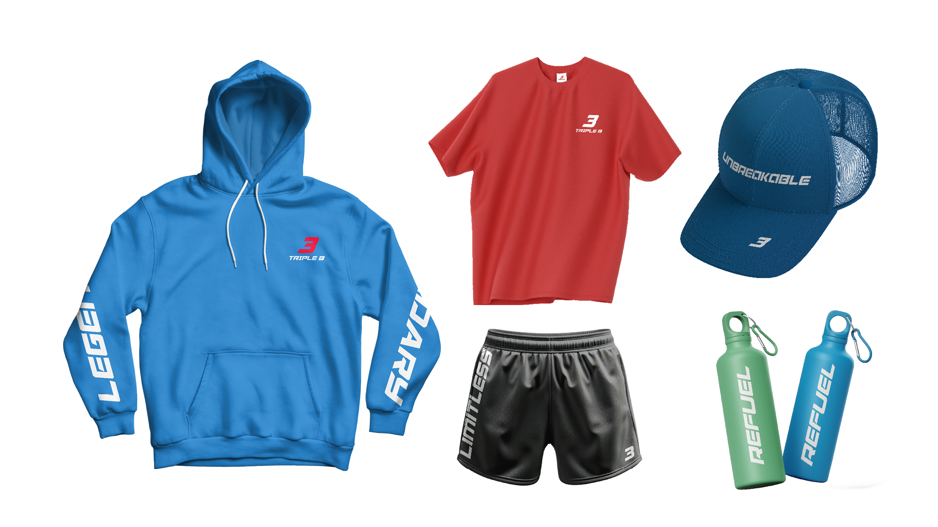
The Triple B identity needed to work hard across every surface: from a chest logo on a
t-shirt to a full billboard. I developed a typographic-led system using bold, condensed lettering and a motivational messaging framework where every product carries a word that pushes the wearer forward.
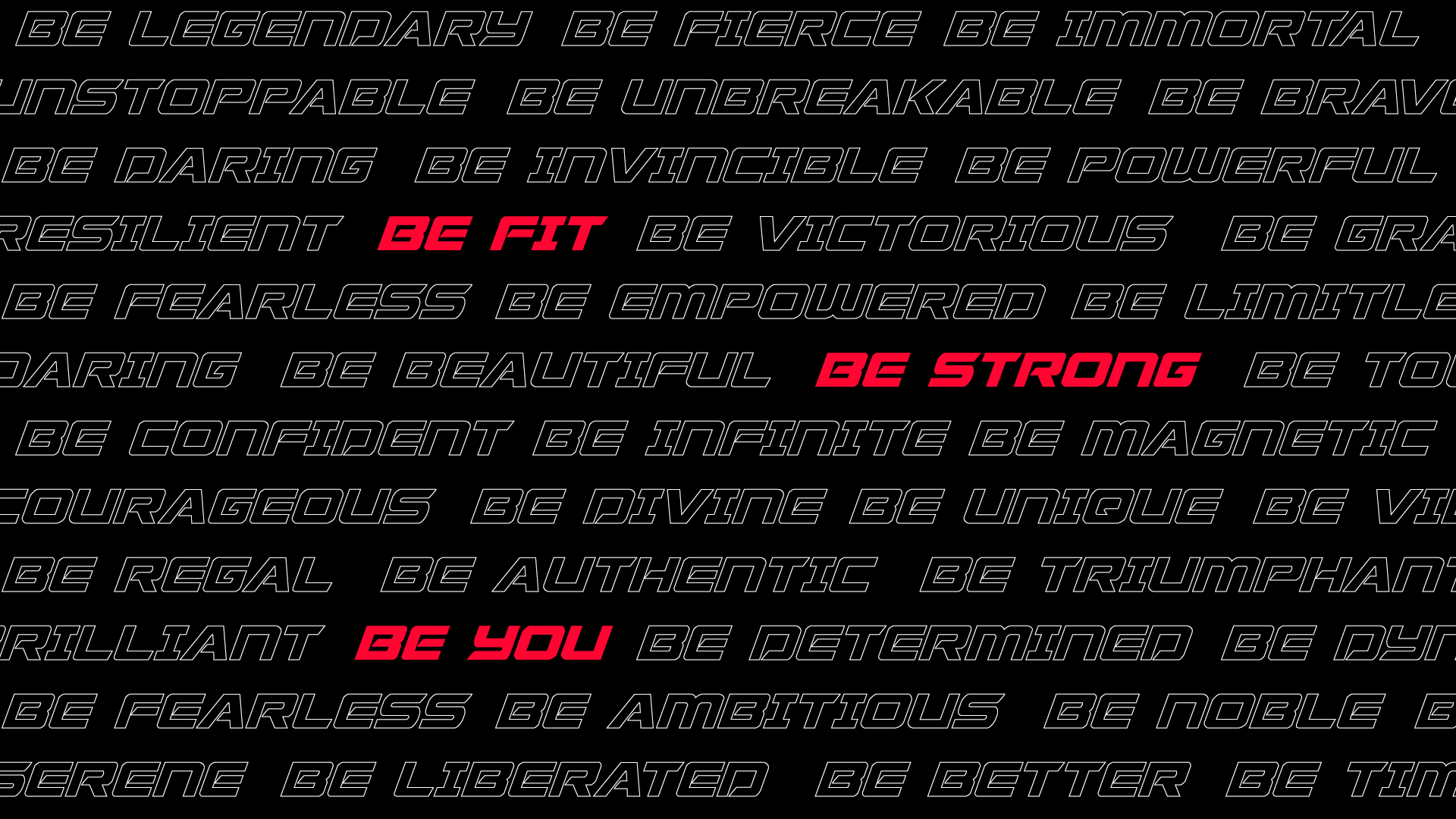
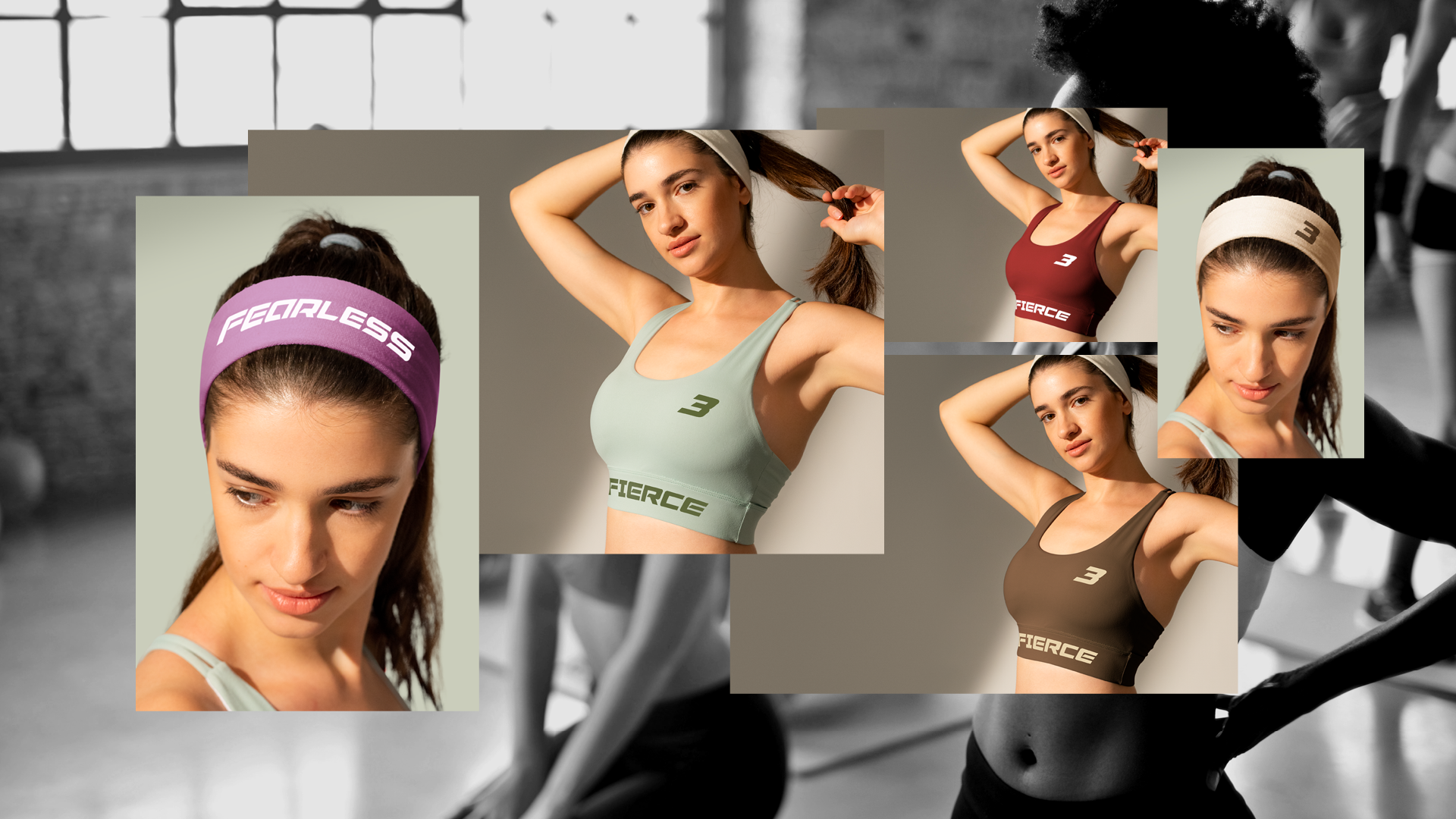
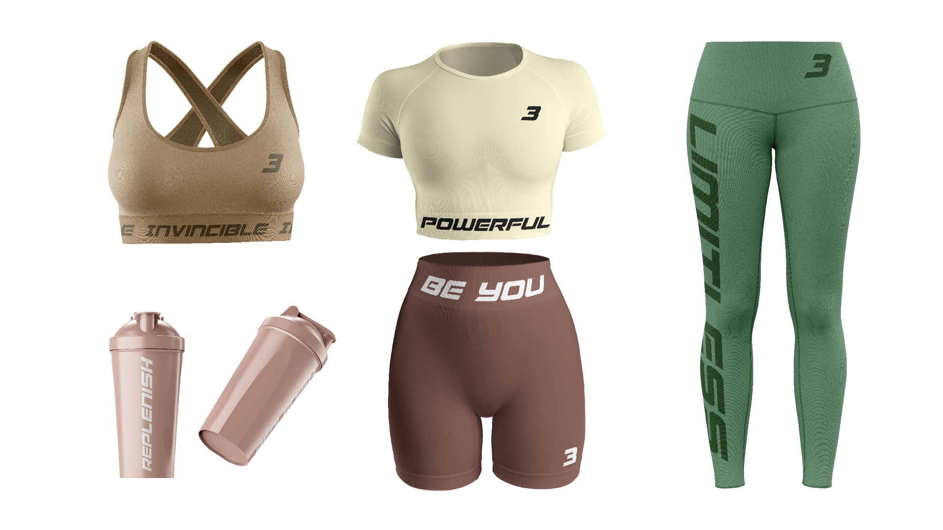
Messaging System
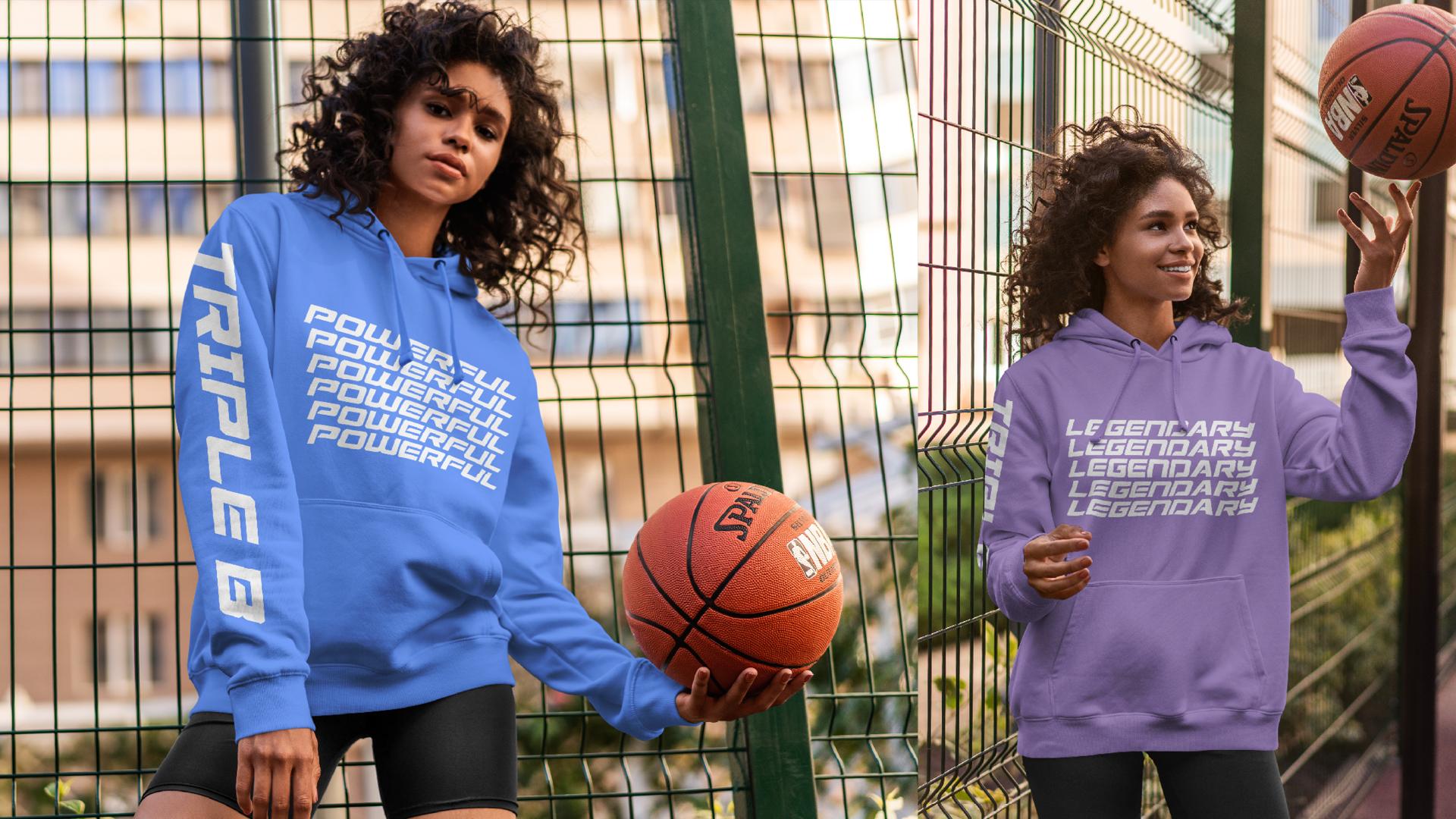
Rather than a single tagline, I developed a language system: a family of motivational words applied consistently across all touch points. Each product carries its own word, turning every item into a personal statement.
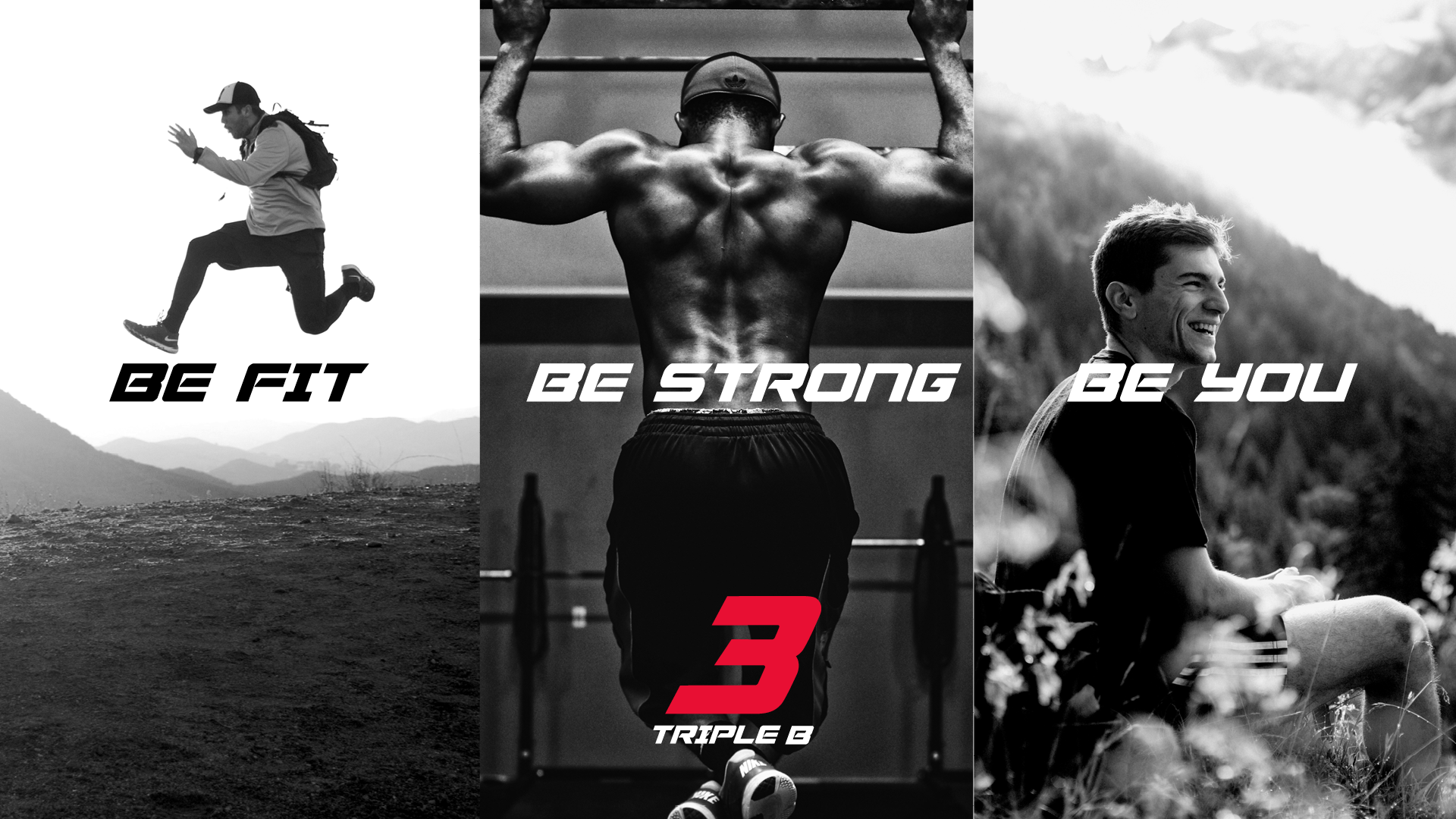
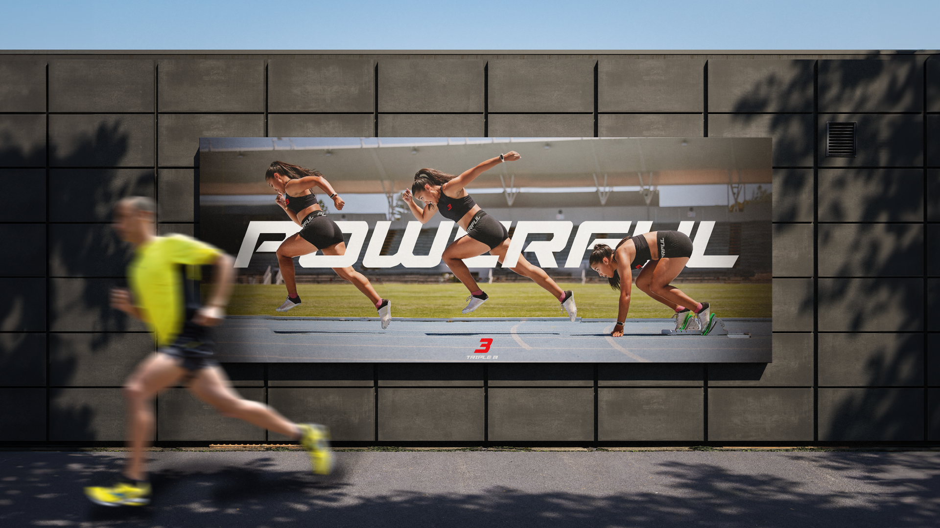
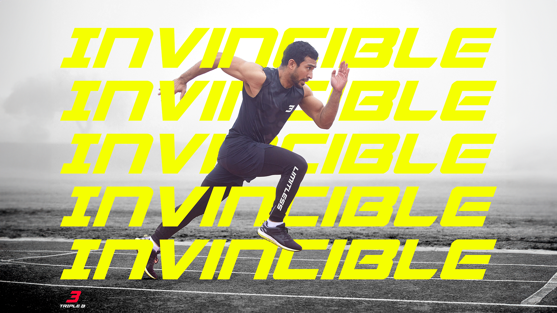
Campaign Creative
The visual campaign was designed to feel raw and athletic, high contrast black and white photography with bold typographic overlays. The art direction deliberately avoids the polished perfection of mainstream sportswear, instead leaning into grit and movement.
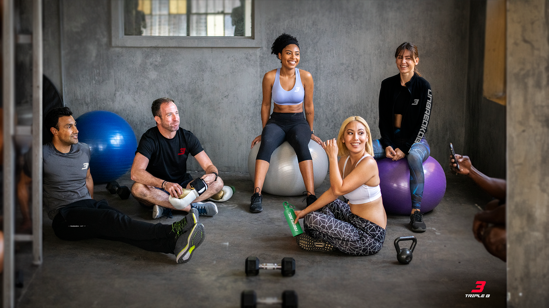
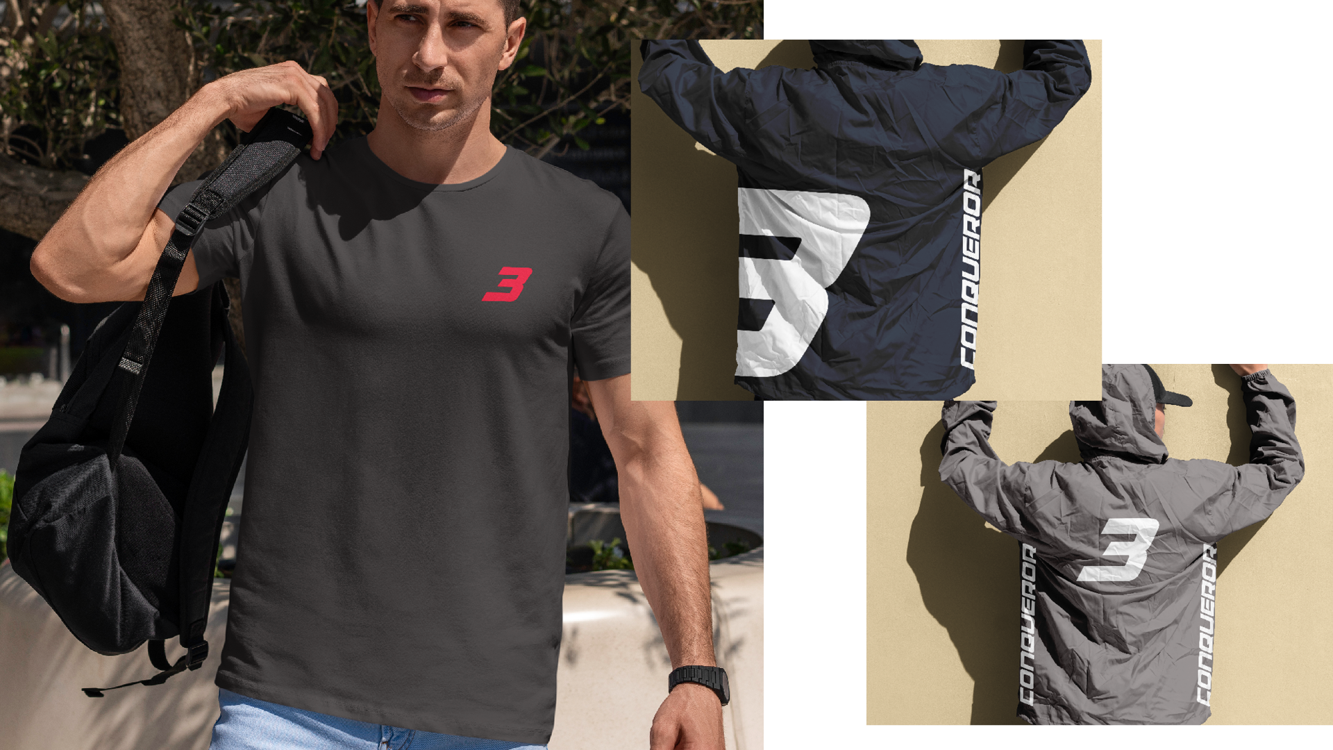
Apparel Design
The brand messaging system was applied across the full apparel range of hoodies, tees, shorts, jackets, headwear, and accessories. Each piece carries a motivational word, ensuring the brand identity is worn, not just seen.
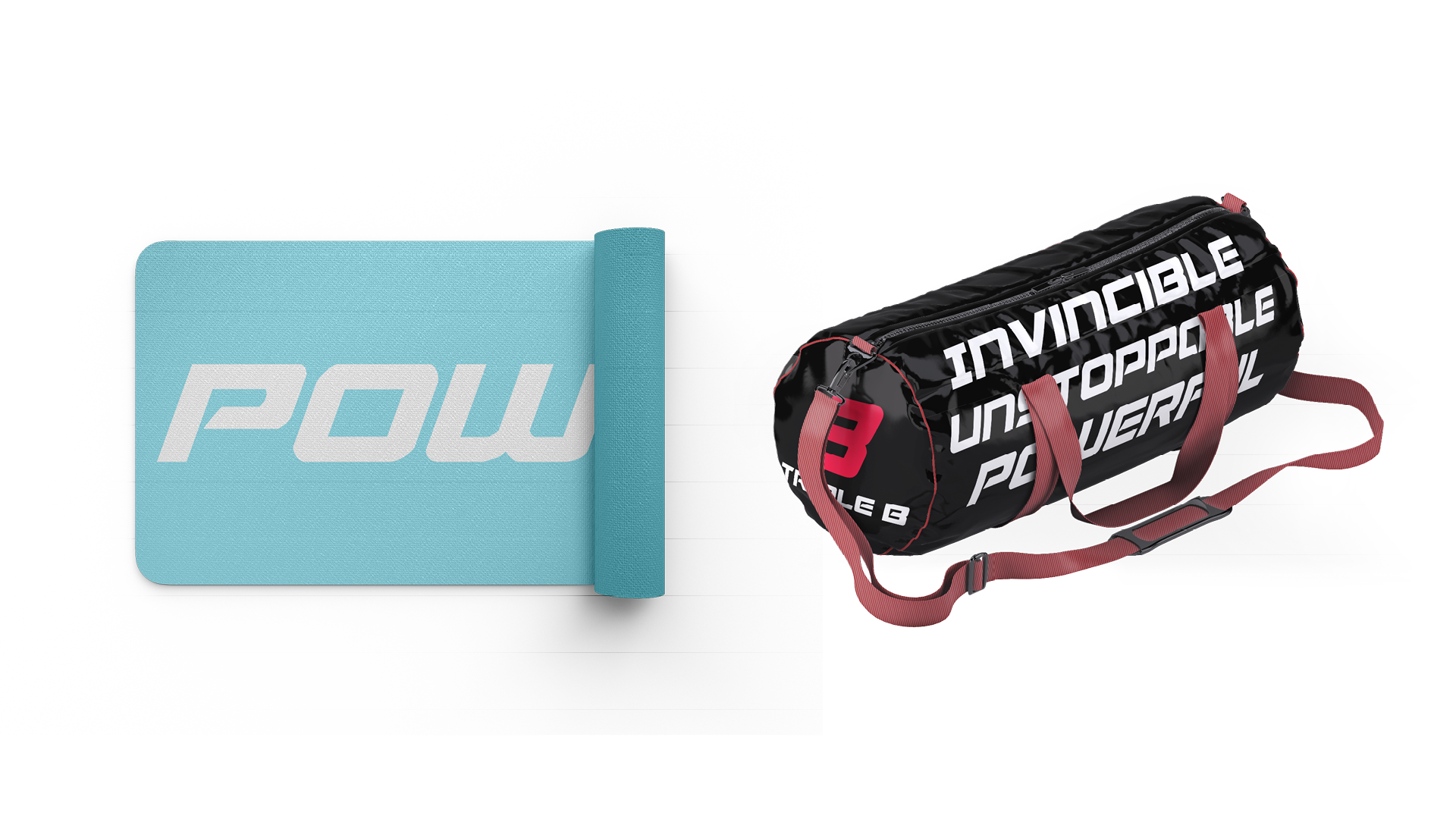
Accessories & Extensions
The brand was extended beyond apparel into accessories and equipment ensuring Triple B could show up consistently at every point of the fitness journey, from the gym bag to the yoga mat to the water bottle.
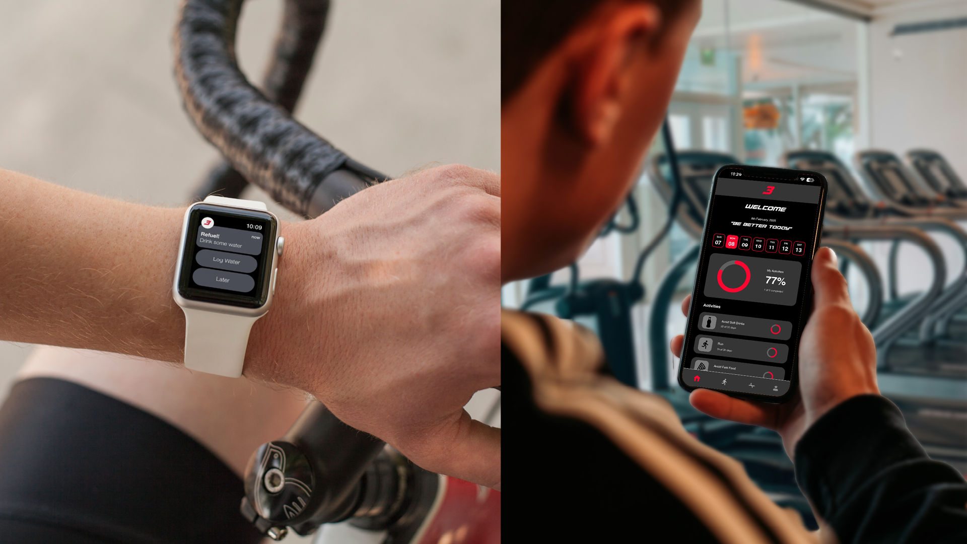
Digital Product Design
To extend the brand into the digital space, I designed a companion fitness app complete with activity tracking, hydration reminders, and a dashboard that carries the Triple B visual identity into everyday use.
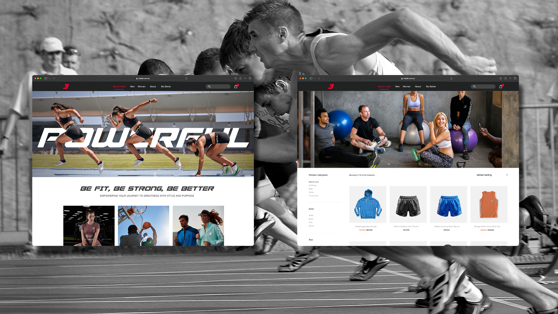
E-Commerce Website
The Triple B website was designed to match the energy of the brand bold hero imagery, strong typographic headlines, and a clean product browsing experience built to convert.