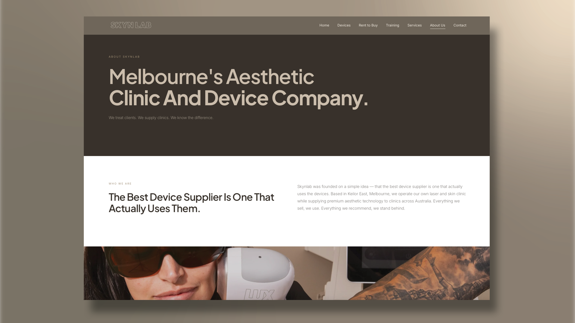
Skynlab is a Melbourne-based company that operates across two distinct markets simultaneously. A B2C laser clinic treating clients directly, and a B2B device supplier selling medical-grade equipment to clinics nationally. Most companies in this space do one or the other. Skynlab does both.
My role has been ongoing as their embedded freelance designer and digital strategist, covering brand, web, print, SEO, and copywriting across every
touchpoint.
The Challenge
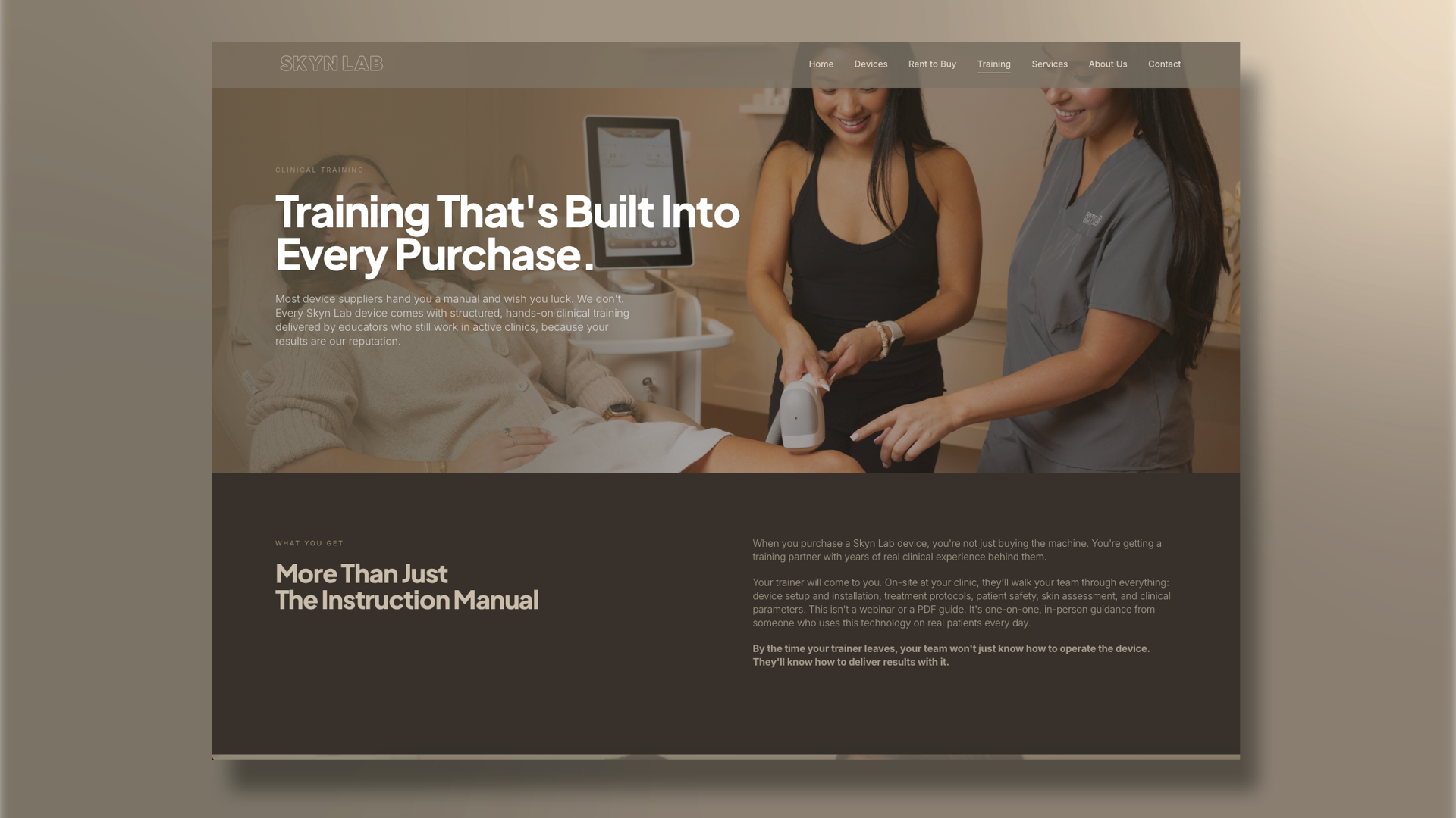
The core problem was a single brand needing to speak to two very different buyers at once. A client booking a laser hair removal session needs warmth, reassurance, and clarity. A clinic owner evaluating a premium device purchase needs technical credibility, clinical proof, and a supplier they can trust long-term.
The visual language, website architecture, and all printed collateral had to serve both without feeling split or generic.
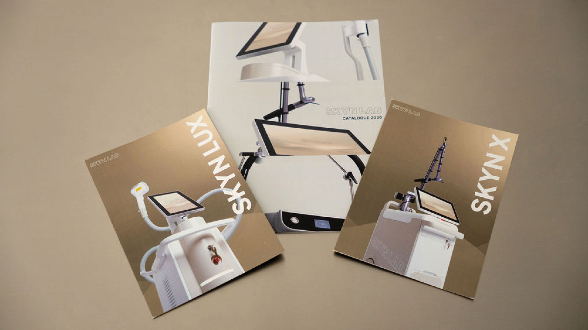
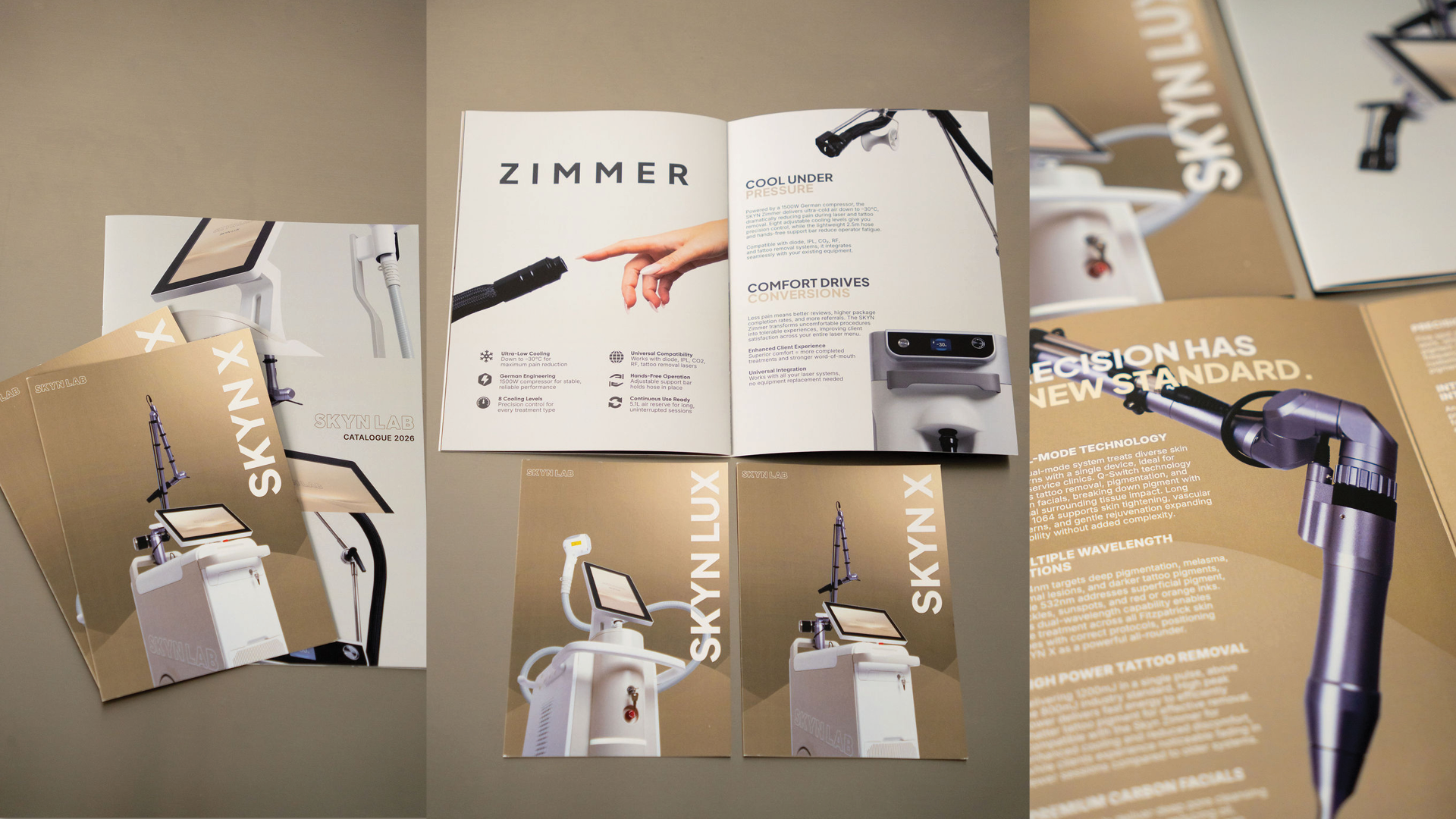
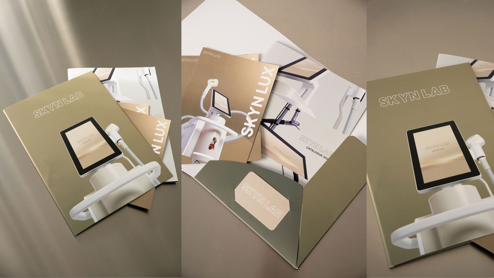
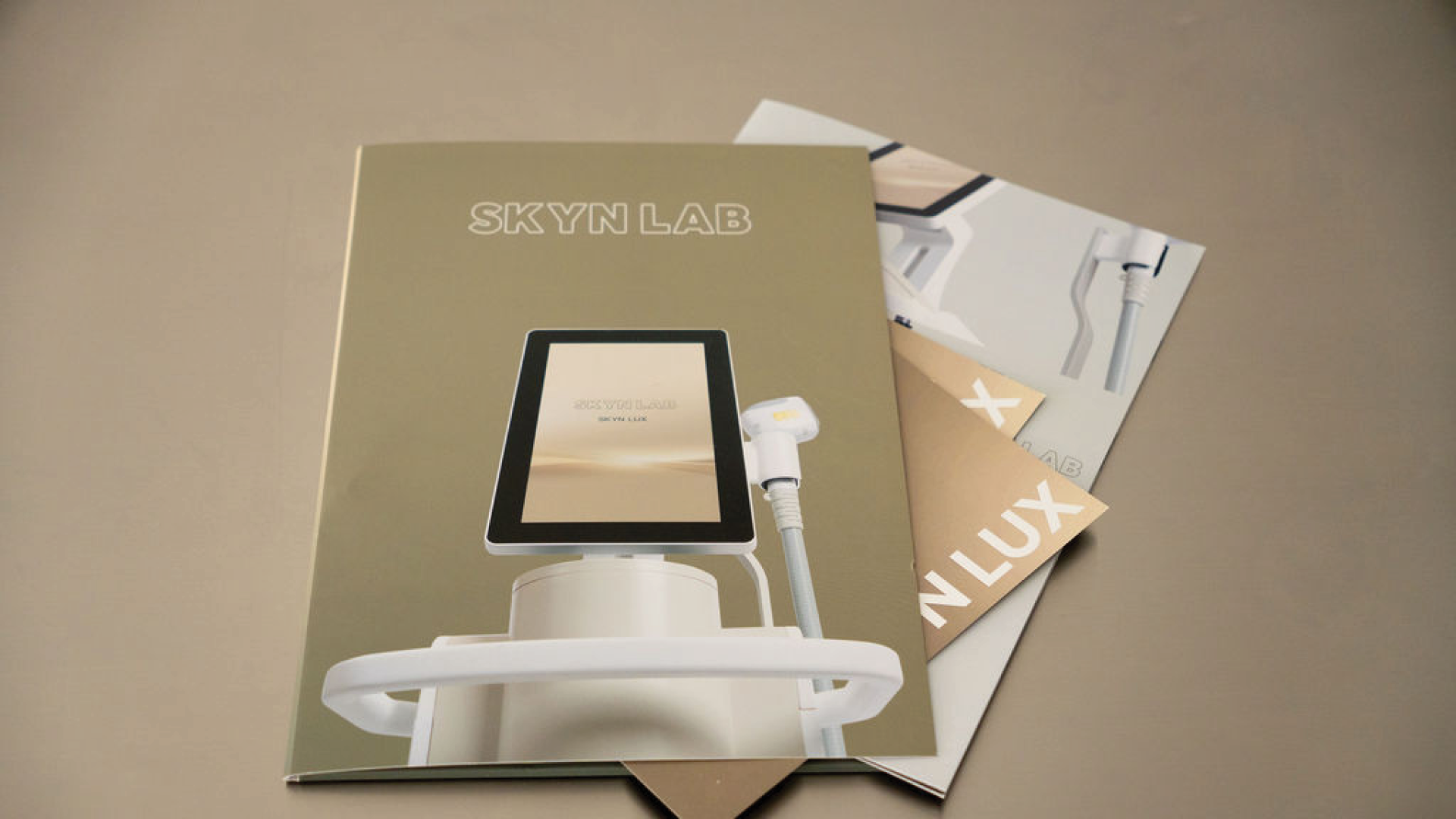
Print & Catalogue
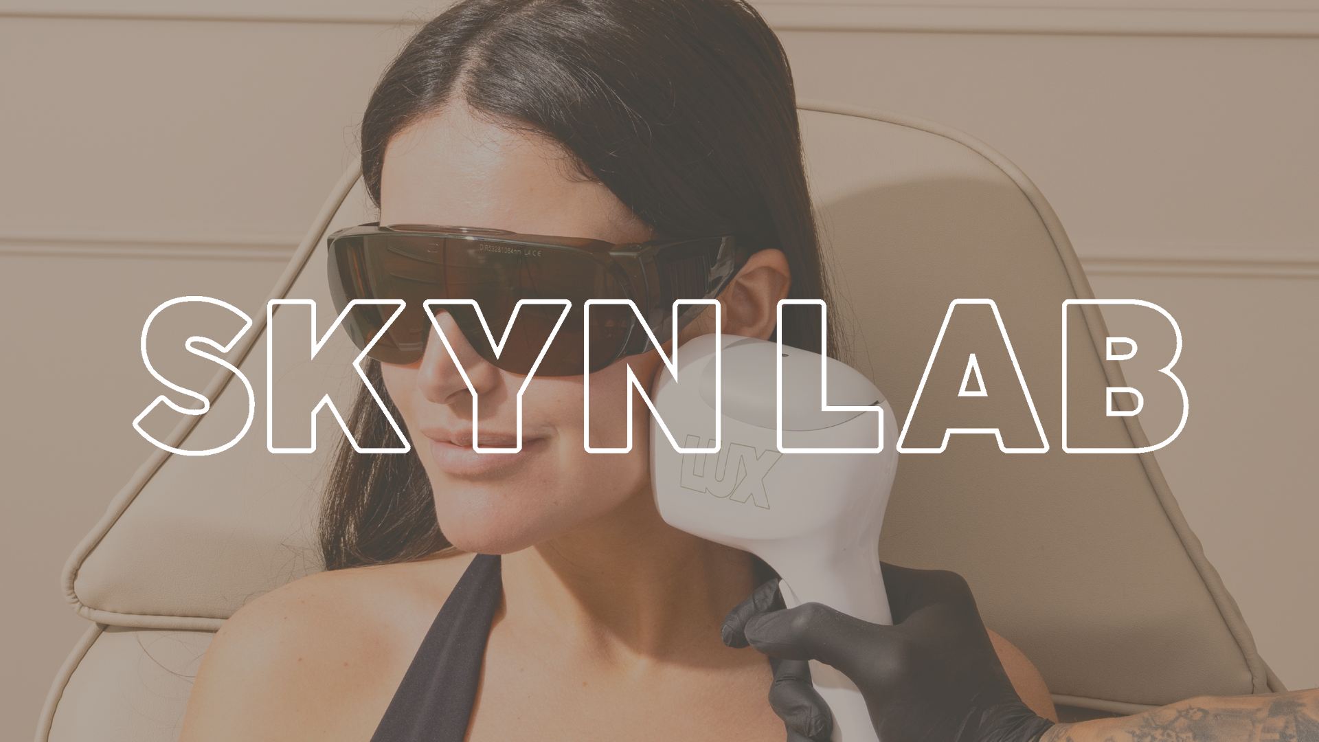
The 2026 Skynlab Catalogue and individual device brochures were designed to sit alongside the website, not just complement it. The same visual language of warm khaki gold, outlined display type, and device renders on coloured grounds runs through both print and digital so the brand reads consistently whether a clinic owner encounters Skynlab at a trade event or online.
Interior spreads lead with benefit-driven headlines before specs. Cool Under Pressure for the Zimmer. Precision Has a New Standard for the X. The copy architecture mirrors the website, building familiarity across every touchpoint in the sales funnel.
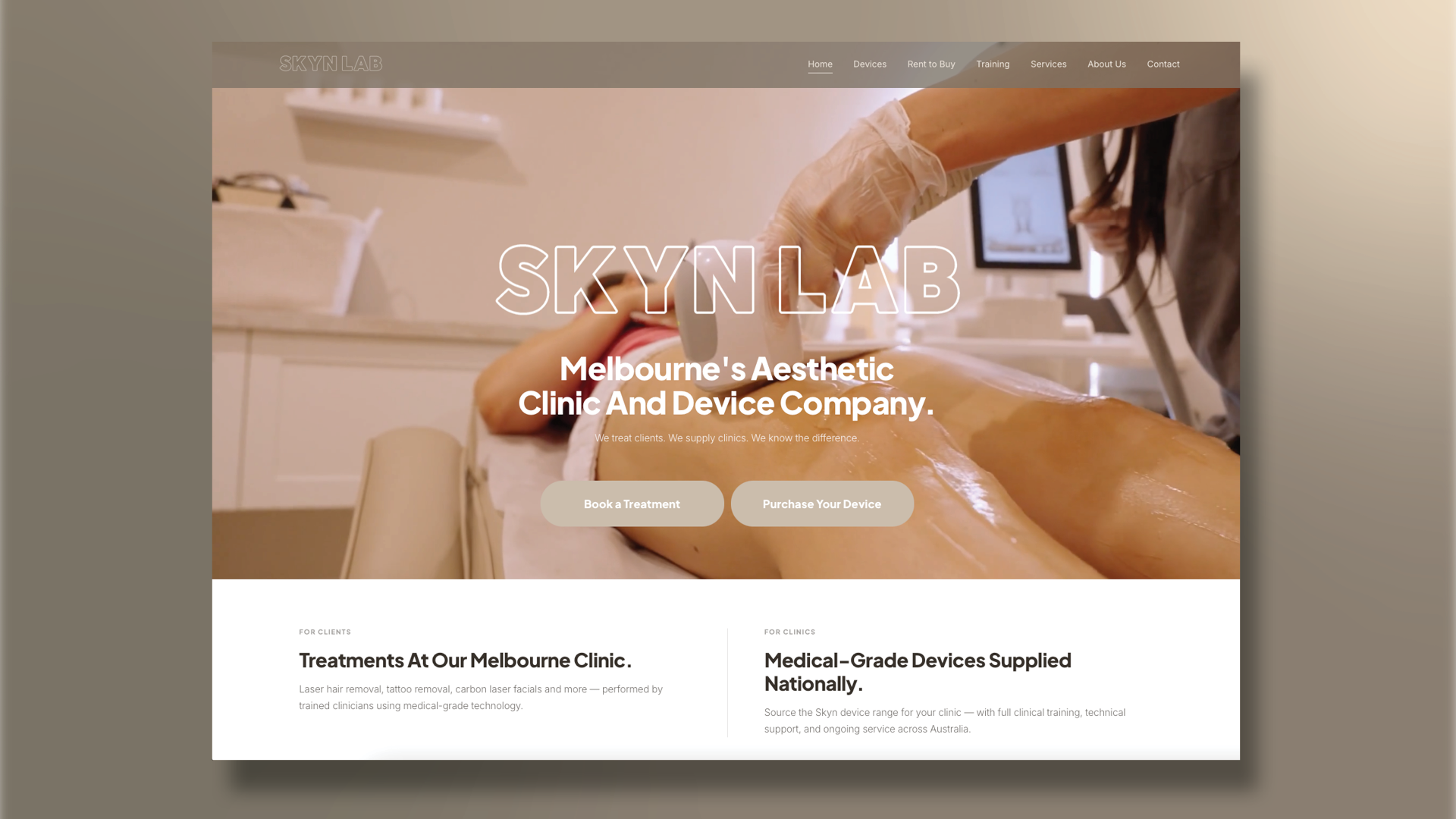
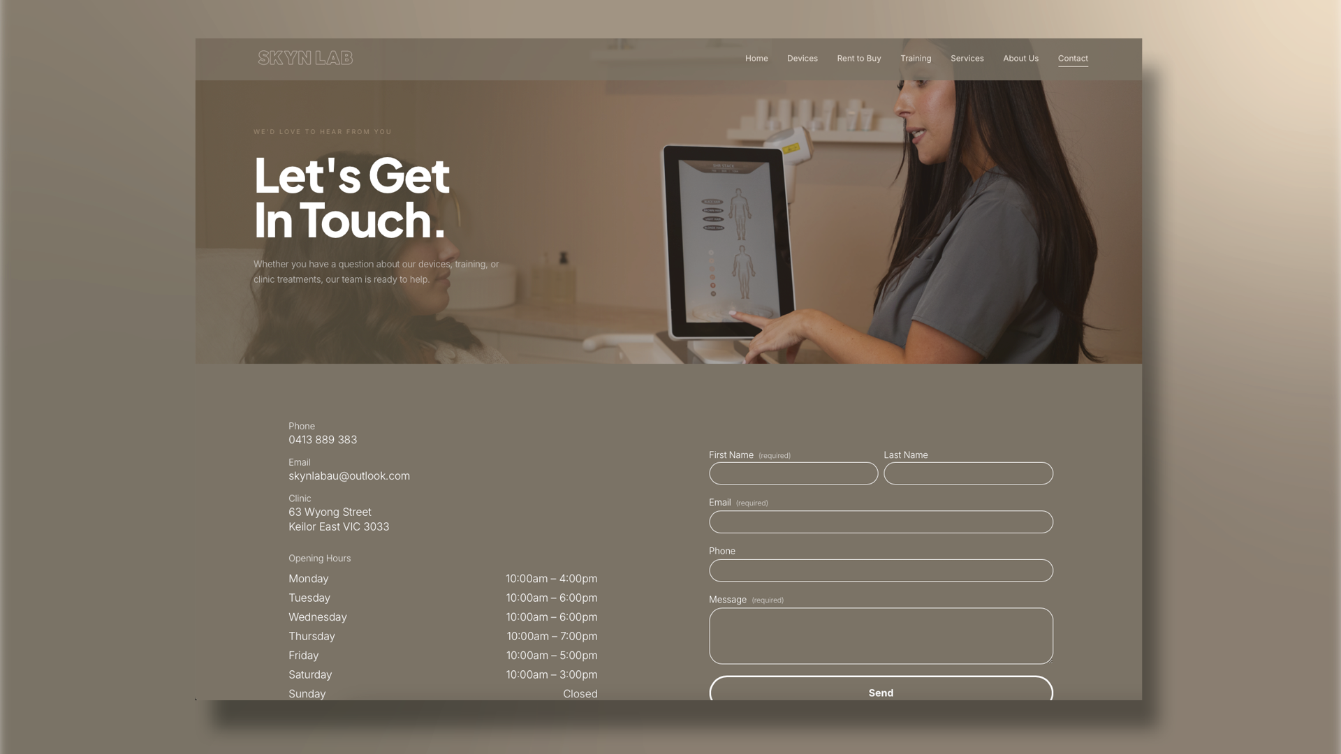
Website
The Skynlab site is built on Squarespace but functions well beyond what the platform does out of the box. I developed a custom component library using injected HTML and CSS with a BEM naming convention, giving every page a consistent and maintainable structure. AI was used throughout as a development tool, accelerating the build of custom animations, scroll effects, and schema markup while keeping every creative and strategic decision mine.
The homepage forks immediately, routing each visitor to a purpose-built path without forcing either to wade through irrelevant content. Navigation, CTA hierarchy, and copy were all designed with this dual intent in mind, with AI helping execute the vision faster, not define it.
Copywriting
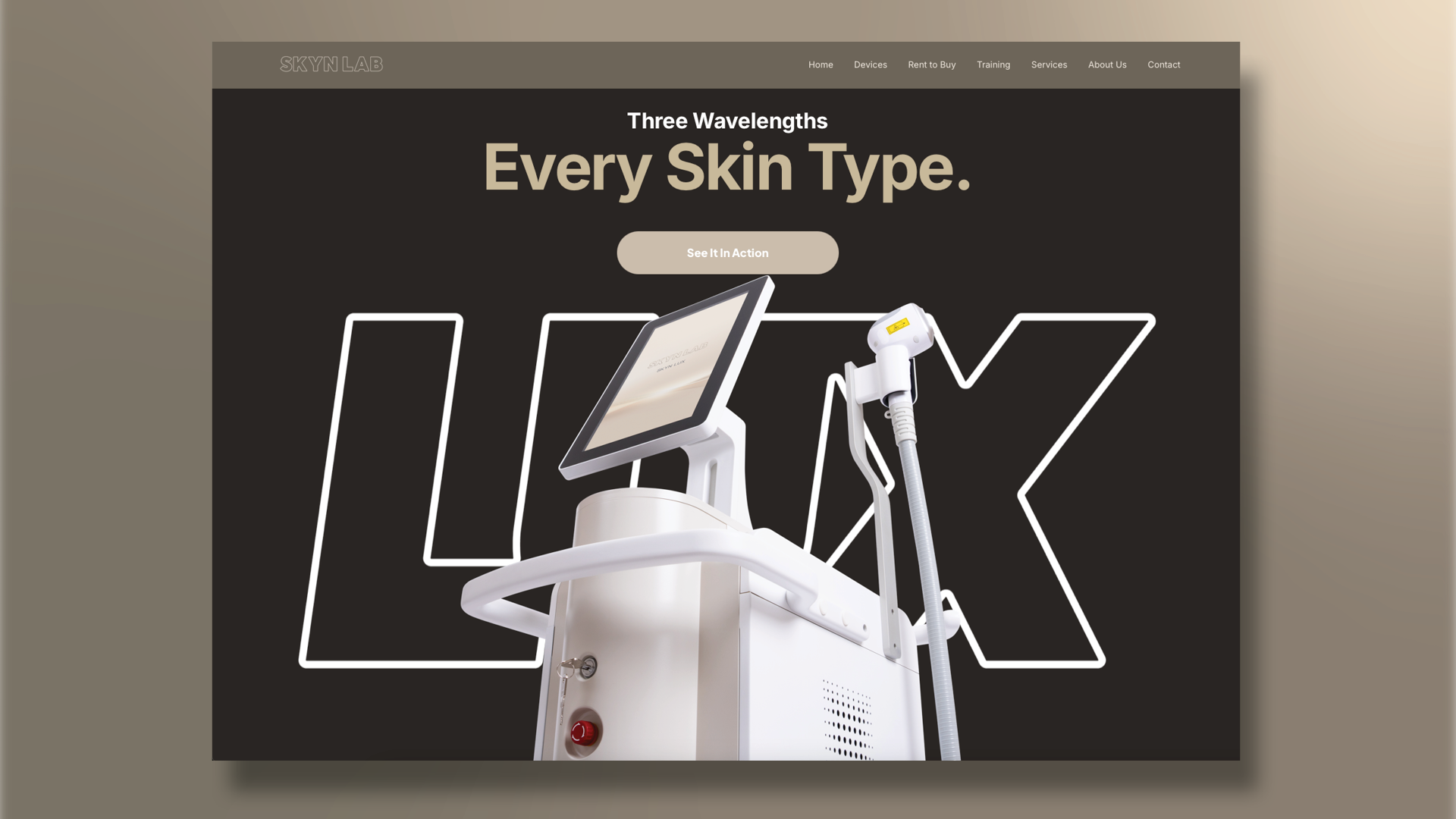
Every word on the site is mine. I developed the brand voice, direct, confident, slightly clinical but never cold, and applied it across eight pages of copy from scratch. The homepage line "We treat clients. We supply clinics. We know the difference." came out of wanting to own the dual-market position head-on rather than soften it.
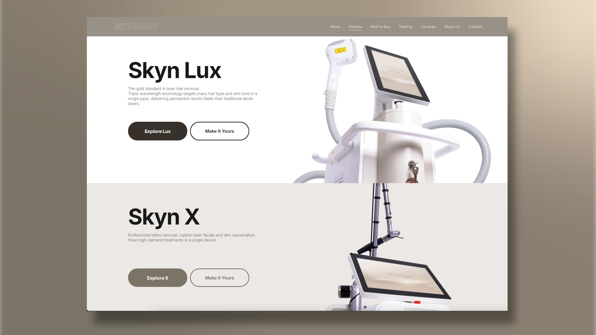
Product page headlines like "Three Wavelengths. Every Skin Type." and "Precision Has a New Standard." were written to work as standalone statements, something you'd put on a trade wall, not just a webpage.
Device Pages
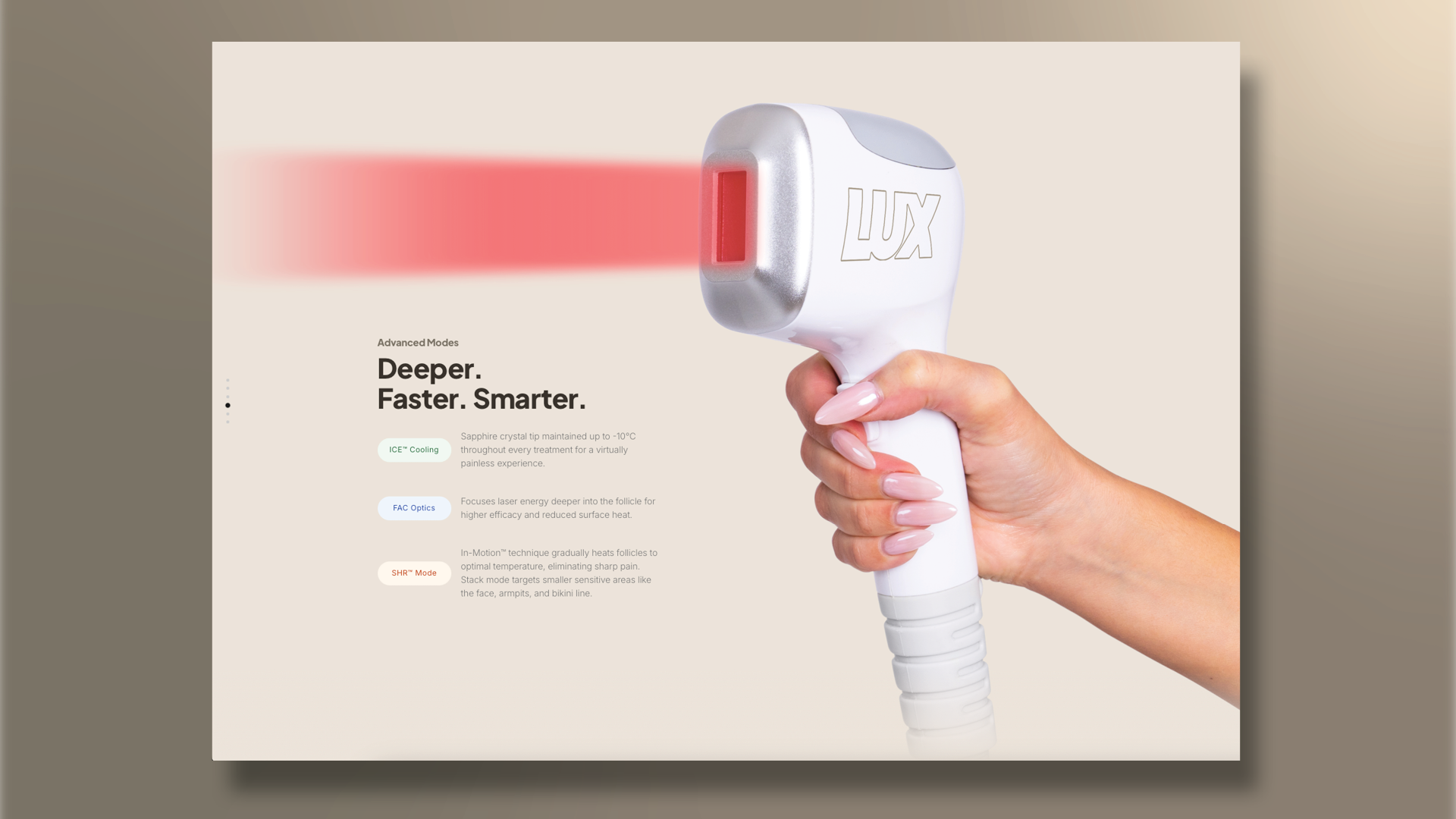
Each device page was built as a standalone experience with scroll-based visual moments layered PNG animations, clip-path laser wipe effects, and an SVG particle animation for the Zimmer cooling page. The dark aesthetic shifts to light for clinical feature sections, using section contrast as a pacing device throughout.
SEO & Technical Setup
Organic search was non-existent when I came on. I implemented the full foundation from scratch meta titles and descriptions across all pages, FAQPage JSON-LD schema across four pages, LocalBusiness and Review schema on the homepage, Open Graph tags, Google Search Console verification and sitemap submission, and Google Business Profile optimisation.
The goal was to build a technical infrastructure that would compound over time, not just a site that Google couldn't read.
Design System
Typeface: Plus Jakarta Sans across all weights, chosen for its geometric warmth and legibility at both display and body scale.
Colour: Onyx dark, Warm Gold, and a Cream surface form the primary palette. The gold runs identically through print and digital.
Components: Pill-shaped CTAs, white stroke cards, outlined wordmark type as a display layer, and transparent section backgrounds for colour inheritance consistent across every page and every printed piece.
Reflection
Working as a solo embedded partner on a project this broad means every decision has a downstream effect. A colour choice made for the catalogue affects the web palette. A copy line written for the website ends up on a trade brochure. The discipline of maintaining coherence across mediums without a brand team or creative director checking the work forced a level of systems thinking I wouldn't have developed any other way.