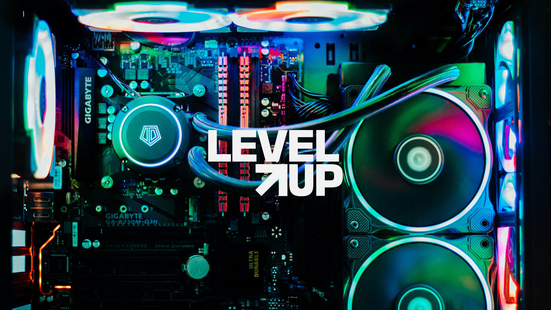
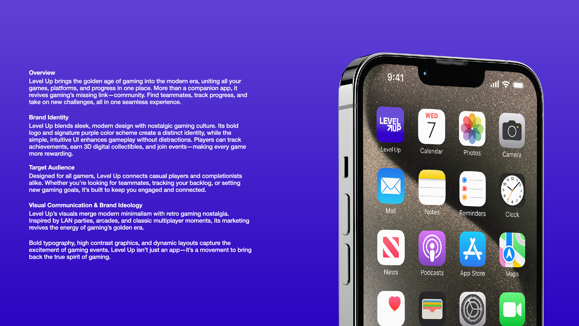
Brand Identity & UI Design
Level Up needed a visual identity that felt at home in the gaming world without defaulting to generic esports aesthetics. The bold, geometric logo, signature purple palette, and high-contrast UI system merge modern minimalism with nostalgic gaming energy clean enough for everyday use, exciting enough to feel like an event.
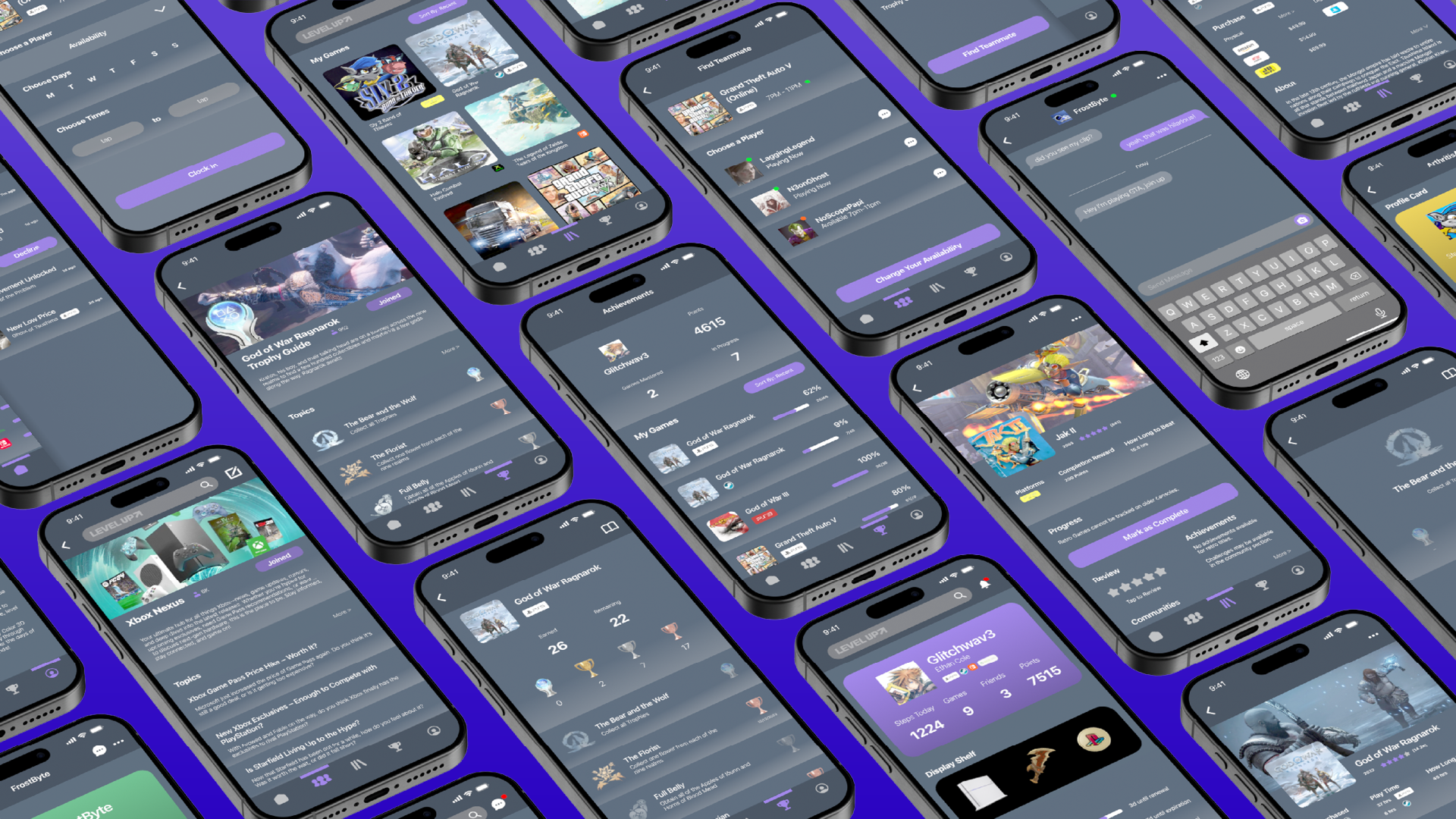
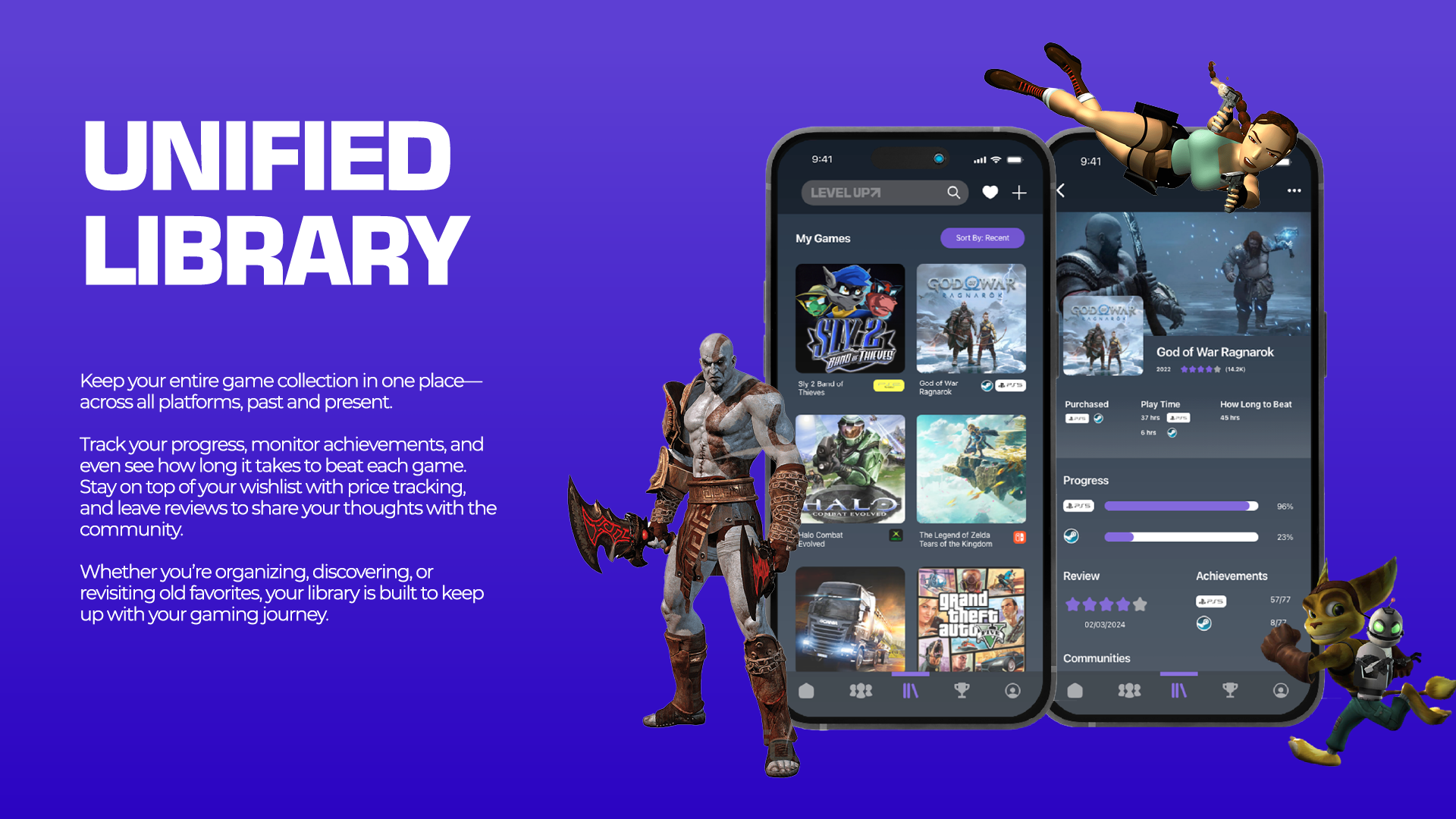
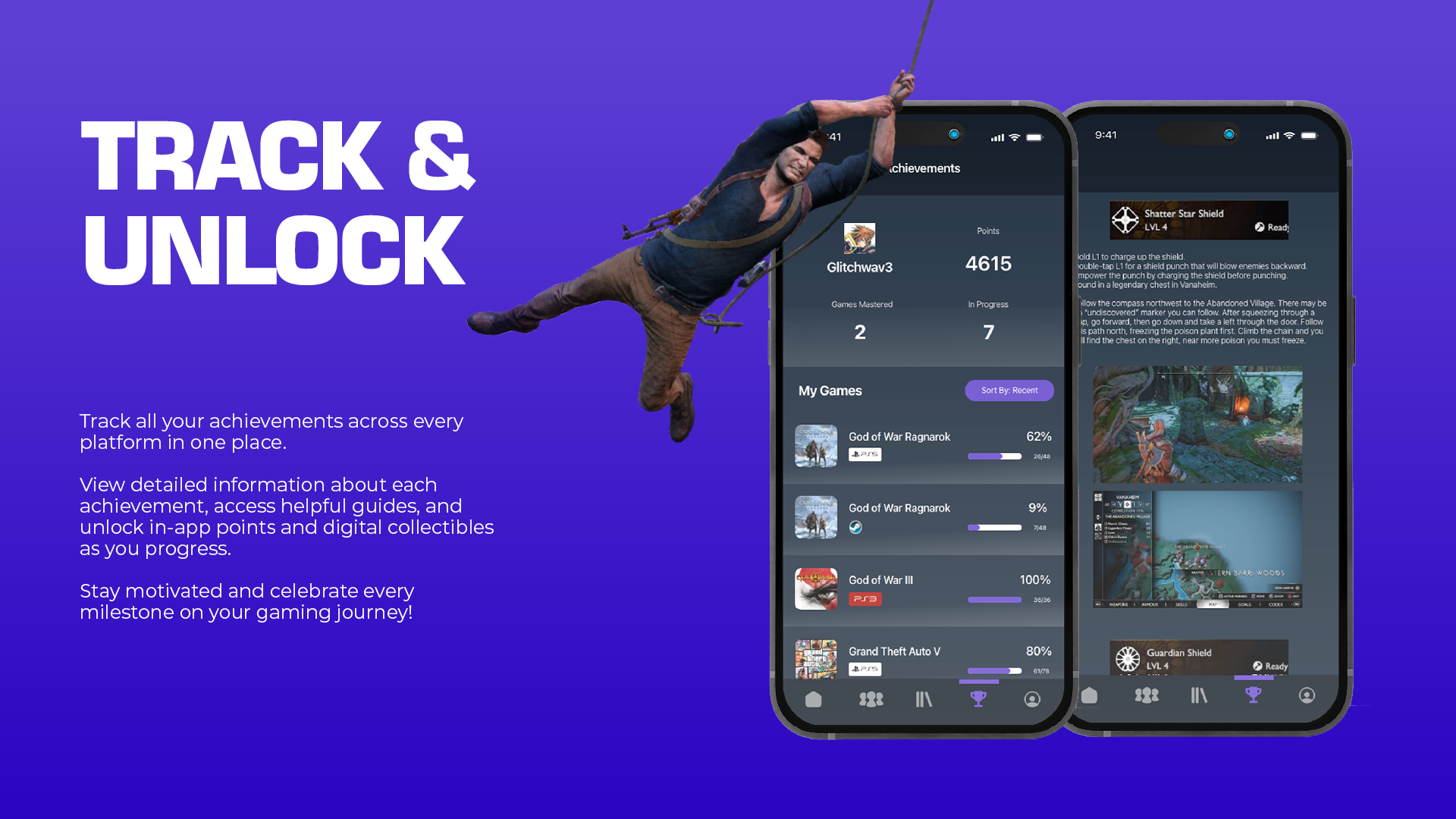
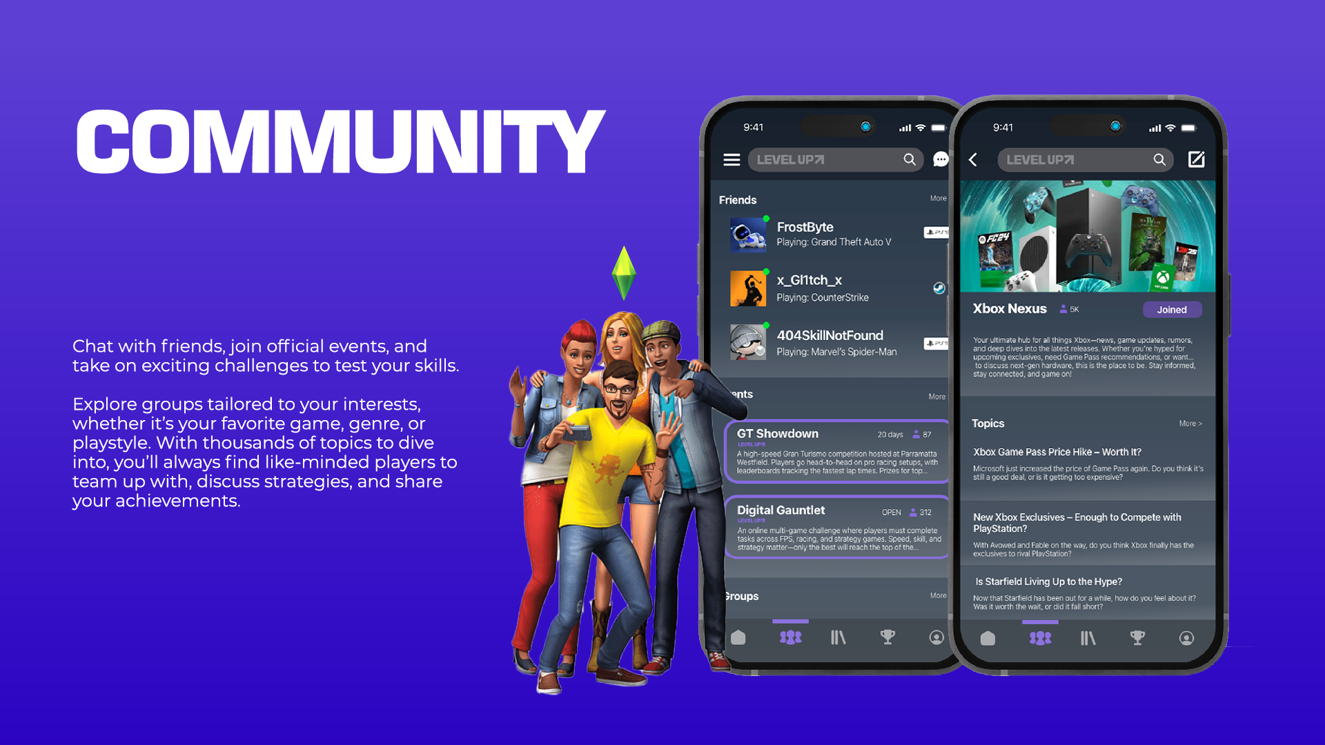
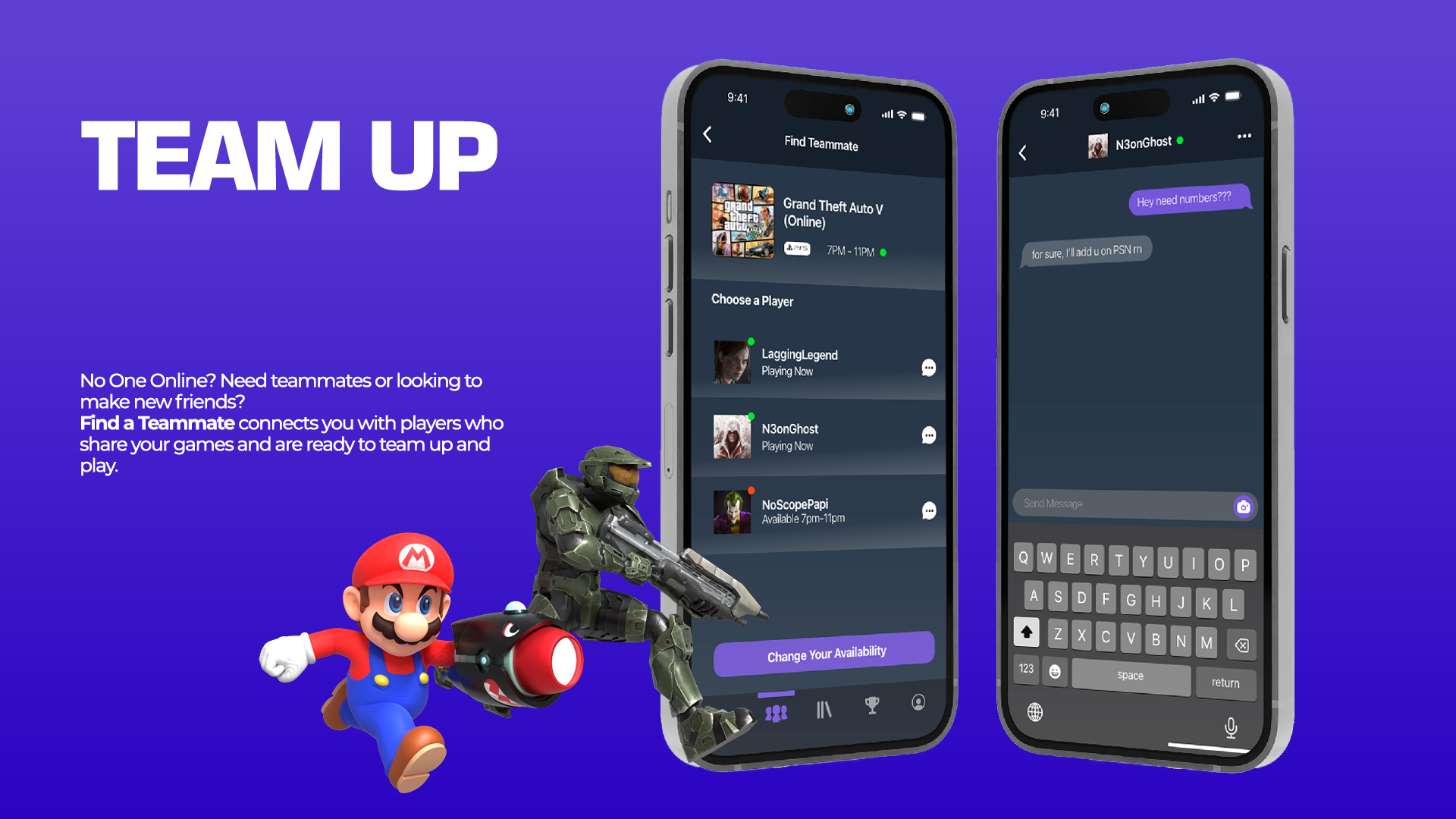
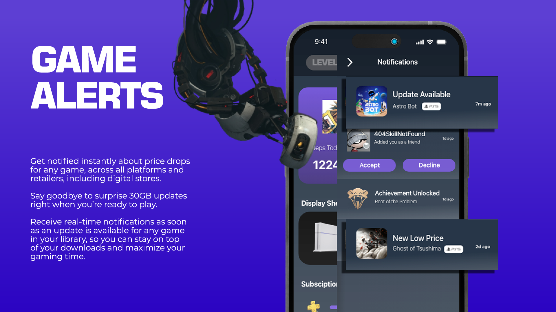
UI Design System
Every screen was designed around clarity and engagement keeping the player informed without overwhelming them. The dark UI with purple accents creates a consistent visual hierarchy across a complex feature set spanning library management, achievement tracking, community, and discovery.
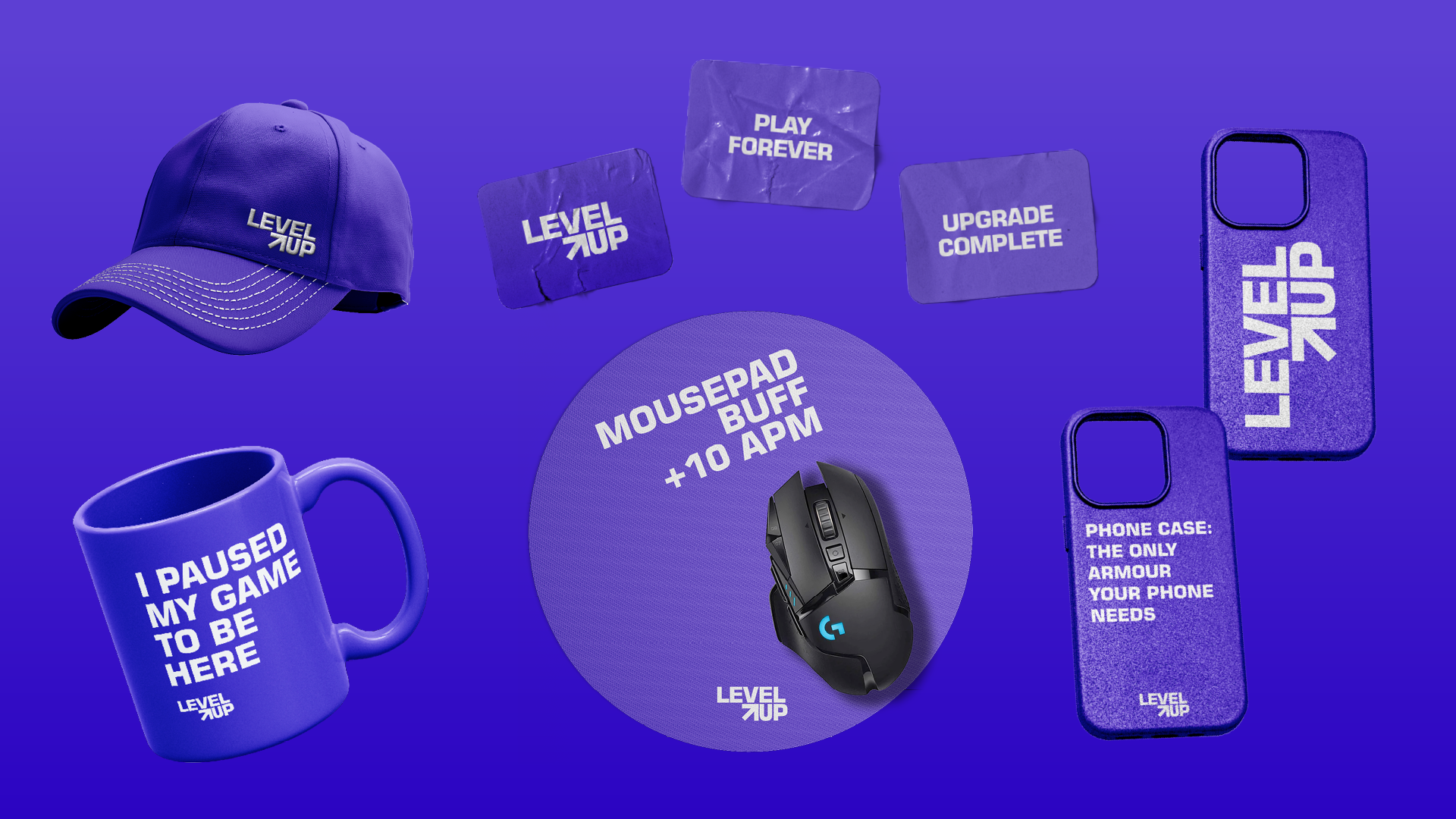
Brand Extensions
The Level Up identity was extended into a merchandise range each piece carrying the brand's sharp typographic voice and signature purple with playful, gamer-native messaging.
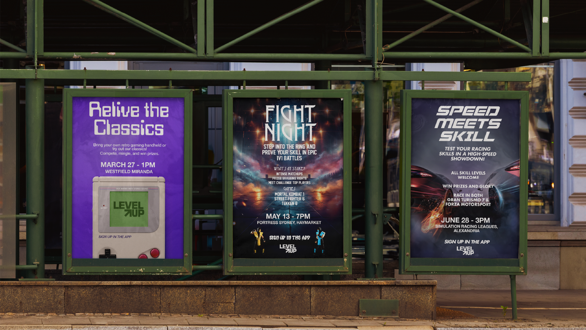
Campaign & Out-of-Home
The event poster series brings the brand into the real world three distinct gaming event campaigns each with their own visual personality while staying unmistakably Level Up.