
Brand Identity & Packaging
Gelato needed a visual identity that felt rooted in Italian heritage without feeling like a museum piece. I designed a logo with an oil-painted quality, an open Florentine window and built a packaging system around Majolica tile patterns, colour-coded to each flavour to create instant shelf recognition while maintaining a warm, artisanal feel.

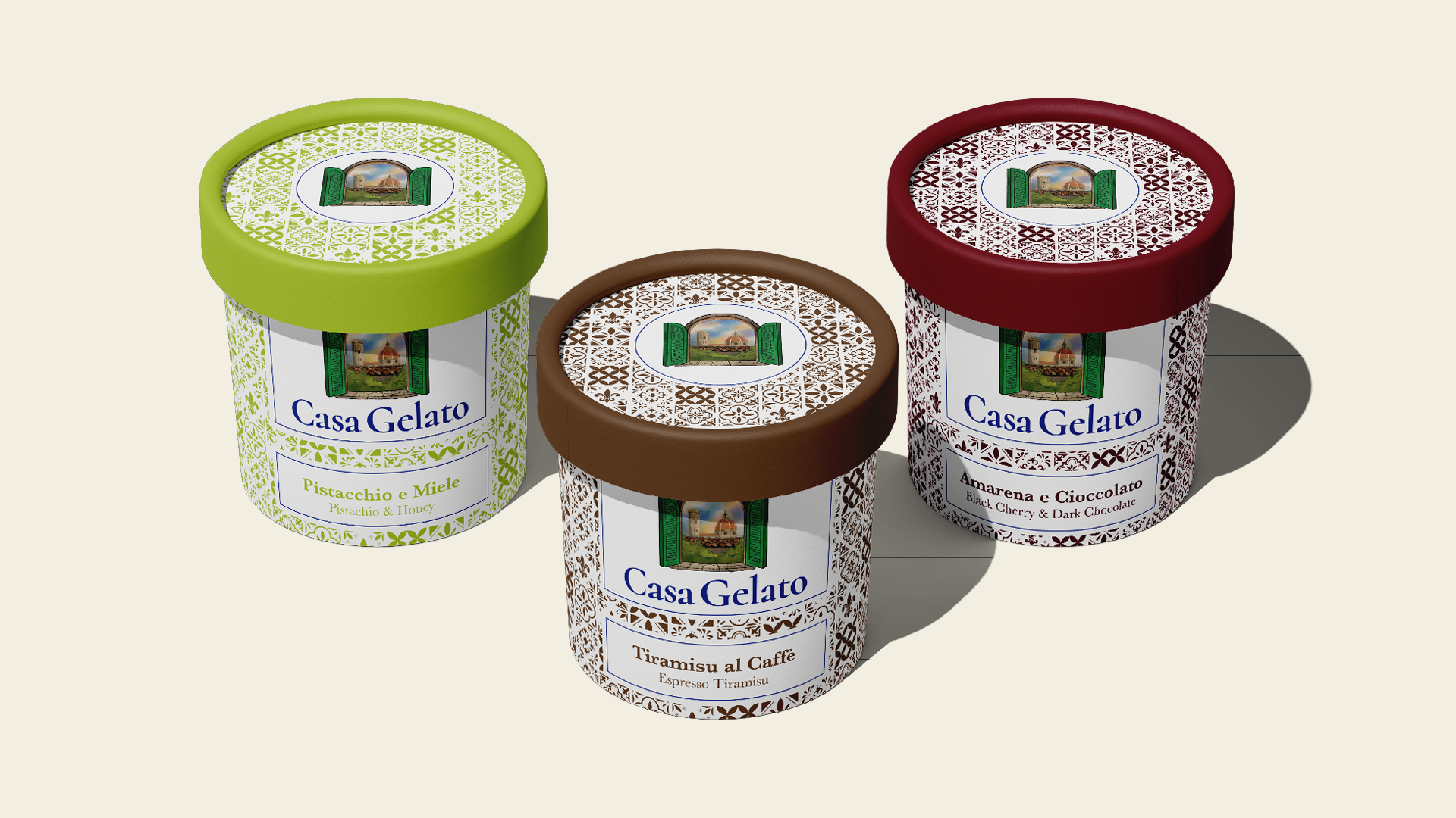
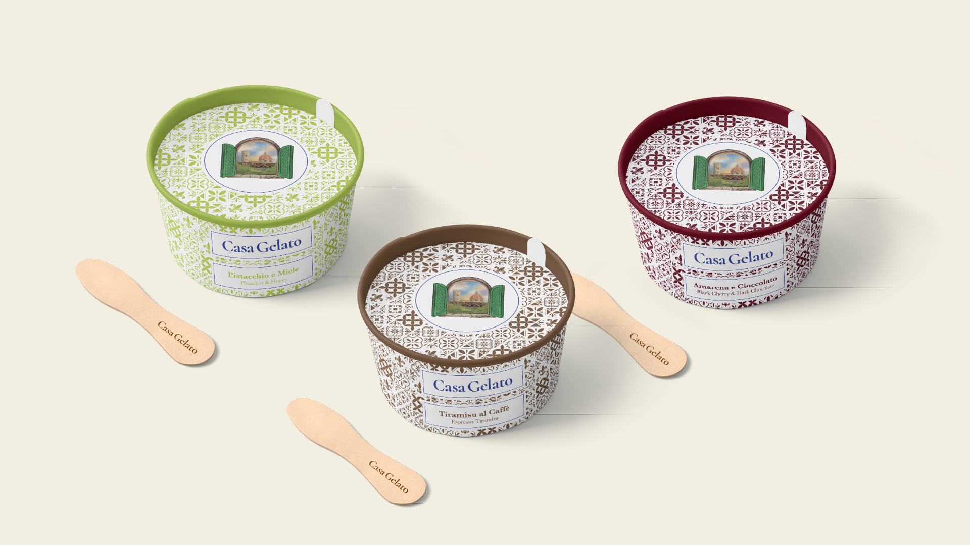
Product Range
The packaging system was designed to scale effortlessly each flavour adopts its own colour while the tile pattern, label structure, and logo placement stay consistent. The branded gelato spoons extend the identity into the eating experience itself.
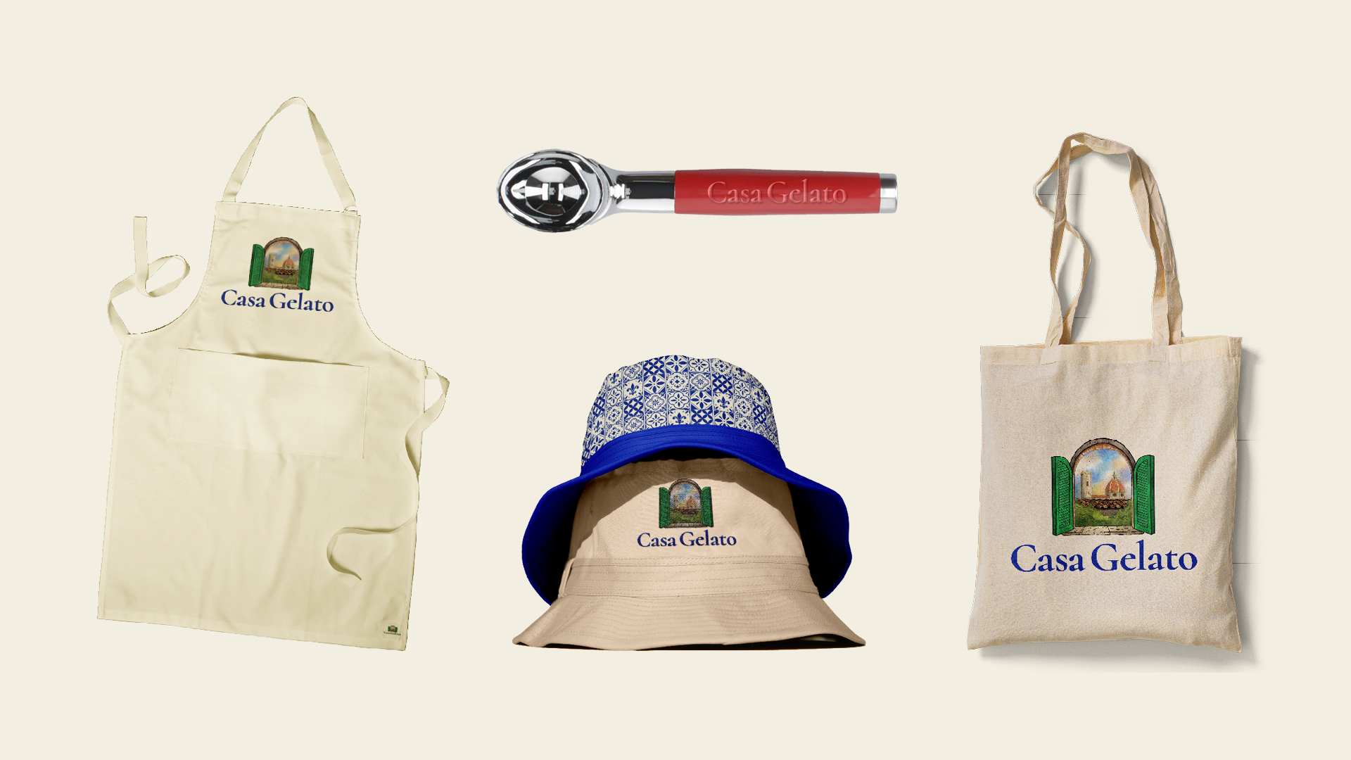
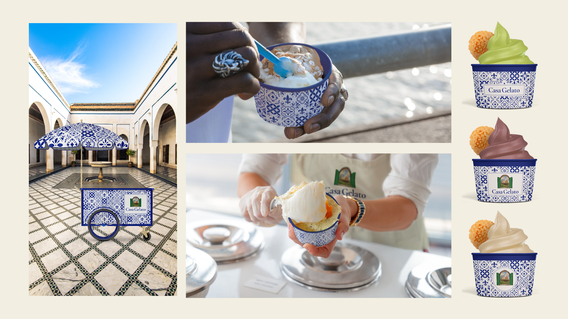
Brand Extensions
The identity was extended across retail packaging and a merchandise range ensuring Casa Gelato shows up consistently whether on a supermarket shelf, a pop-up cart, or worn by staff.
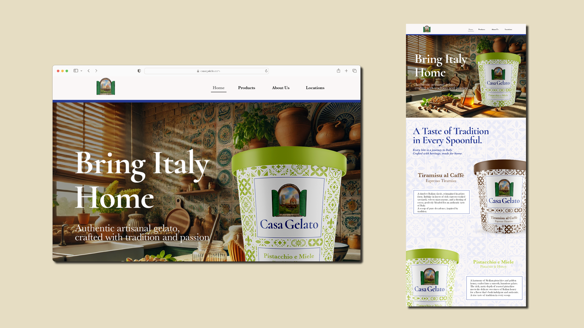
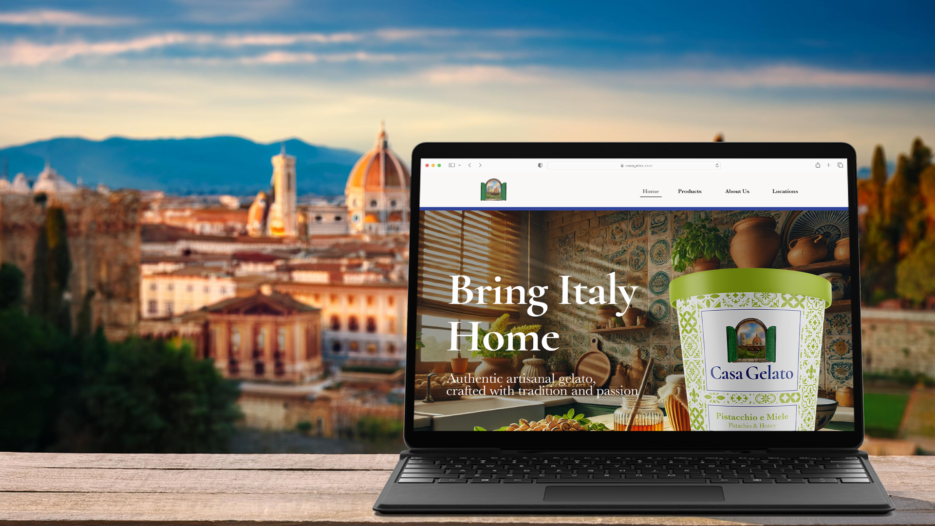
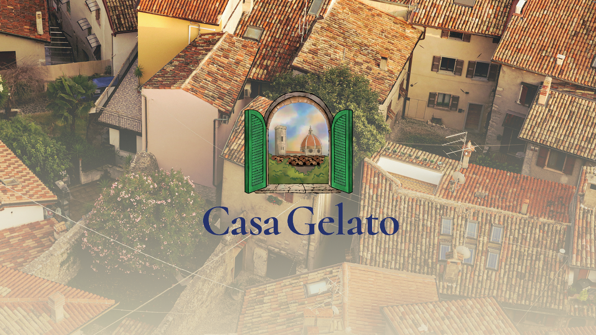
Website & Digital
The website was designed to transport visitors to Italy the moment they land warm kitchen imagery, heritage typography, and the brand's tile motifs creating an immersive digital experience that mirrors the product's emotional promise.
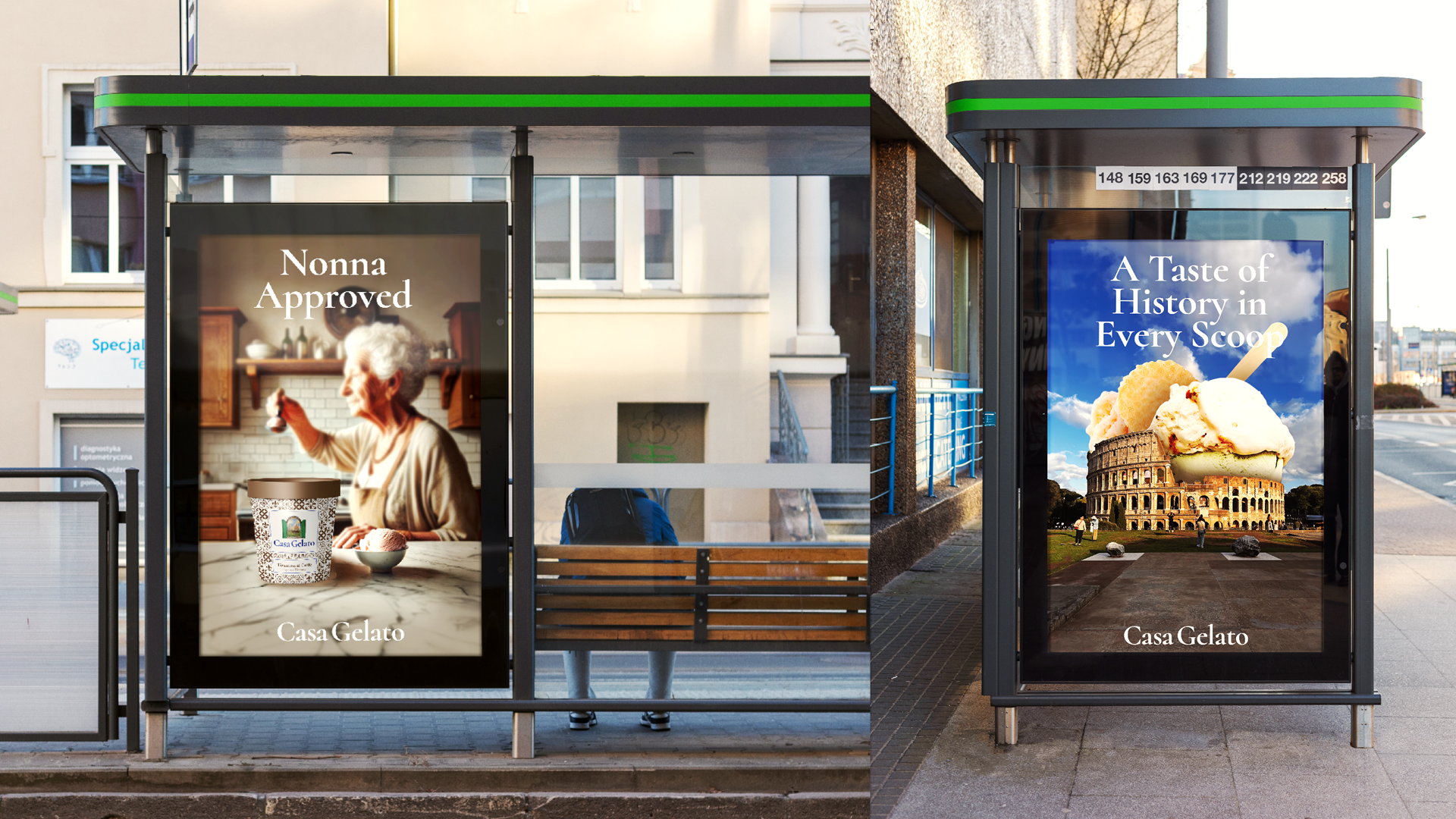
Out-of-Home Campaign
"Nonna Approved" and "A Taste of History in Every Scoop" two campaign executions that bring warmth and character to the brand in the real world.